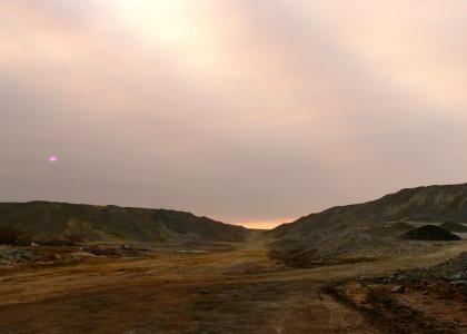
The world, post-internet... (see description)
Created on: July 18th, 2009

After michealjacksondies.ytmnd.com ripped off jacksonparentsmourn.ytmnd.com, OmniIcyshelf went on about how the second one was better because it had "a better title" and "better music" so it was ok that it was a duplica
Sponsorships:
| user | amount | user | amount |
|---|---|---|---|
| No one has sponsored this site ( ._.) | |||
| Sponsor this site! | Total: $0.00 | Active: $0.00 | |
Vote metrics:
| rating | total votes | favorites | comments |
|---|---|---|---|
| (3.57) | 7 | 1 | 11 |
View metrics:
| today | yesterday | this week | this month | all time |
|---|---|---|---|---|
| 0 | 1 | 0 | 0 | 1,461 |
Inbound links:
| views | url |
|---|---|
| 43 | https://www.bing.com |
| 13 | http://allmedshoponline.com/ |
| 4 | http://www.baidu.com/s?wd=YTMND-Theworld%2Cpost-internet...(seed |
| 2 | http://www.google.com.hk |
| 2 | http://216.18.188.175:80 |
After michealjacksondies.ytmnd.com ripped off jacksonparentsmourn.ytmnd.com, OmniIcyshelf went on about how the second one was better because it had "a better title" and "better music" so it was ok that it was a duplicate image...so I have taken his last created site and put a better title and music to it
"tard vote"? for not wanting to read on ytmnd? yeah, that makes a lot of sense. Its all about the description in this one, so why not have the entire ytmnd silent with a black background and text that says "read the description". It would be the same ytmnd because what you have now does nothing to enhance the point and quality of the ytmnd.
You've got it all wrong. Both sites in question used a stolen image as the centerpiece of their joke, which is that people celebrated the death of Michael Jackson. The supports for the image were different: One used a silly chiptune, the other had unfitting music. One's title was overworded, while the other was simple and left you with no expectations. Most notably, it was this setup that explains why one succeeded to an extent while the other failed, as you can see with the very example you created here.
"Life After the Internet" is a spin-off from the "Life Before the Internet" fad. The focus of my site, unlike in both of the Michael Jackson sites, is not so much on the image (which is someone else's work) but rather on two central ideas: First, that you might have expected an image related to Lauren Holly and Picket Fences, but instead got a post-apocalyptic landscape, and second, that the world would end at the same time as the Internet.
It seems like you managed to capture the secondary premise, but the first was completely lost on you. That's part of the reason why this site went nowhere. The other is that you have, oddly enough, proven my point with your title and sound selection. You think they're better, but others would seem to disagree with you based on the site rating.
The wall of text ends here, I promise. Point is, both Michael Jackson sites use a stolen .gif that's been posted all over the Internet. One just happened to use it first and didn't use it as well as it could have been used (for something unoriginal and unedited). Really, I should be more critical of both sites for simply attempting to enhance a joke that belongs to the author of the original image. My site attempts to create a joke through the use of its image - that joke isn't IN the image to begin with.
Bold
Italic
Underline
Code
User Link
Site Link