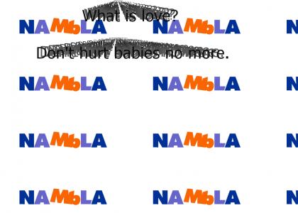
NAMBLA Logo. "M" and "b"... eeeew.
Created on: January 9th, 2006

the NAMBLA's logo is almost a parody of their entire organization. Unfortunantly it's serious.
Sponsorships:
| user | amount | user | amount |
|---|---|---|---|
| No one has sponsored this site ( ._.) | |||
| Sponsor this site! | Total: $0.00 | Active: $0.00 | |
Vote metrics:
| rating | total votes | favorites | comments |
|---|---|---|---|
| (3) | 10 | 0 | 1 |
View metrics:
| today | yesterday | this week | this month | all time |
|---|---|---|---|---|
| 0 | 0 | 0 | 0 | 1,843 |
Bold
Italic
Underline
Code
User Link
Site Link